Achieve continuous psychosocial compliance
Skodel helps busy people and safety leaders meet psychosocial requirements without disrupting other priorities.
Meet compliance with confidence
Adopt an approach to psychosocial safety one regulator describes as “the clearest and most effective approach” they’ve ever seen.
We’ve done the hard work for you
All the planning and tools to achieve psychosocial compliance. Distilled into one easy-to-use document backed by regulators.
Meet compliance effortlessly
You don’t have to shift priorities to achieve psychosocial compliance. Skodel is simple and free from costly resource tradeoffs.


Mental health overview

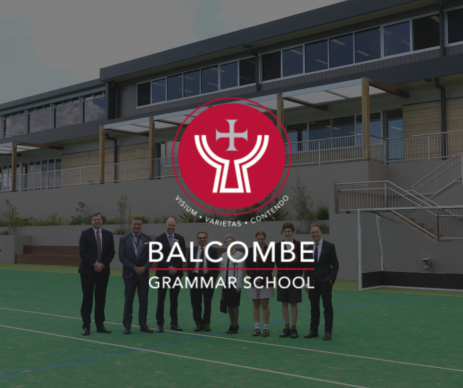
Supporting BGS with Psychosocial Hazards
Balcombe Grammar wanted an efficient way to consult staff on psychosocial hazards. With 145 staff and one dedicated wellbeing leader, the process needed to be simple. We implemented a light touch quarterly check with data feeding into an action plan. It is allowing for essential worker consultation data to be maintained and up to date with minimal effort. Staff appreciate the speed and user experience which makes ongoing participation easy and leadership find value in a relevant set of data they can use to create positive change.
Read more
Why choose Skodel
It will save you significant time and it has been built alongside regulators. We remove the complexity and uncertainty of finding out what you need to do and the best way to do it.


100%
Customer satisfaction on support requests

88%
Said Skodel improved wellbeing & safety

For people and safety leaders
Skodel is for people and safety leaders in highly regulated industries who need to meet psychosocial compliance but have minimal time and resources to do so.
Our approach is guided by best practice safety standards
Skodel helps organisations and leaders embed best practice in psychosocial safety as per international standards and legislation.


Why we partnered with Andrew
Skodel partners with clinical psychologist, Andrew Fuller, to enhance user experience. Andrew has been described as someone who “puts the heart back into psychology”. He is a clinical psychologist and Fellow at the University of Melbourne. Creating a great experience for people reduces the resistance to participation that often increases workloads for leaders. It can help turn what is traditionally a cumbersome compliance exercise into a competitive advantage, boosting engagement, retention and productivity. Andrew has helped Skodel build an experience people and leaders will appreciate you for.
Andrew Fuller, Clinical Psychologist & Author

Skodel Resources
Navigate the challenging landscape of mental health best practice and legislation by hearing from psychologists and safety leaders.